
We talk a lot about color here in the Curbly neighborhood, which led me to wonder, is there such a thing as too much color?? Then I started looking for evidence, collecting images of rooms that seem to be on the tipping point. I’ll let you decide onto which side they fall….color fail or color fabulous.
The white linen in this bedroom serves as a palate cleanser.
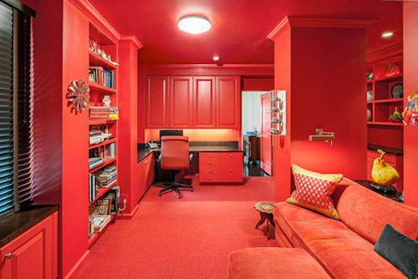
Must Love Red. And monochrome.
Must Love Blue and White blue. And toile. Lots and lots of toile.

Bolder than bold? Oh, yes.
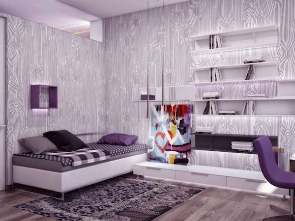
Did anyone say purple? Or, specifically, purple wood grain wallpaper? (Who knew??)
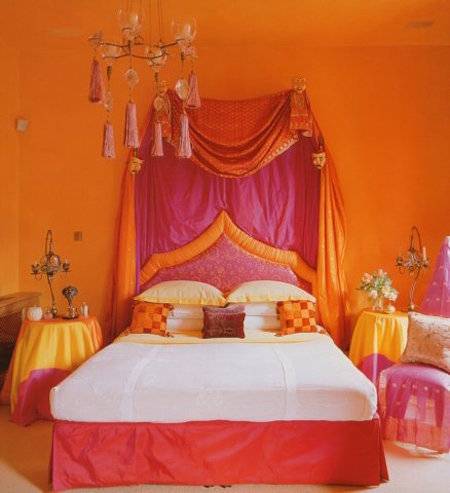
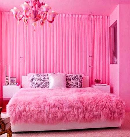
Is it possible to get this much pink into one room without the help of Photoshop? I dunno.
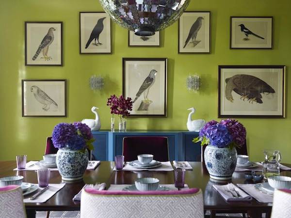
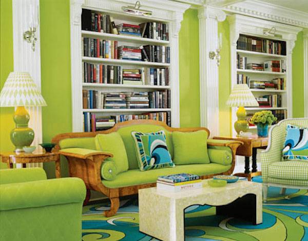
And, finally, this room proves that acid green works well with white. And groovy blue swirls.
So, there they are, seven of the most colorful rooms I could find on the tipping point of color fail or color fabulous. Now it’s up to you! What do you think??
Some of these are a bit over the top for me, but I CANNOT stand living in a house of white rooms. It drives me nuts. My living room is closer to the greens in the photos (Gleeful by SW) with a navy sofa. I have to say, during the endless grey winter days this color makes all the difference in my mood.
Having just burnt my cornei (sp plural) out, I would say that some colors are fine but not so intense that you go blind looking at them.
Most of these are way over the top.