
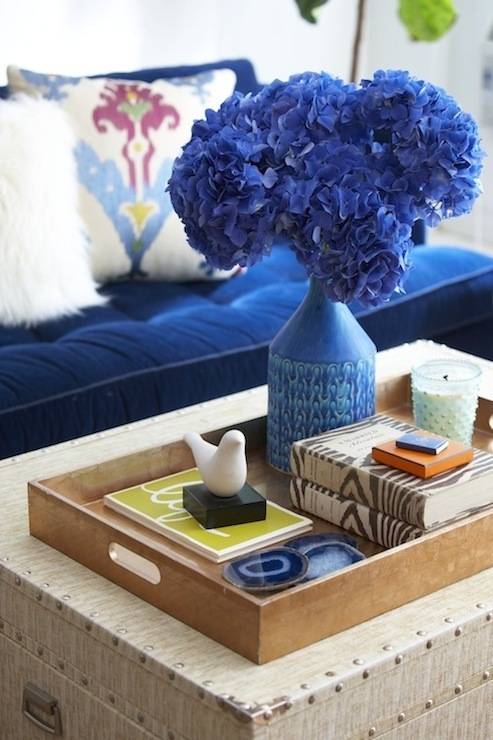
Did you hear? Recently, Pantone announced its spring 2014 color and PPG picked its fav for the entire year. First Pantone’s pick: Dazzling Blue, which is described as
a “peppy shade of cobalt.”

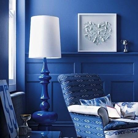
Are you Dazzled? Okay, maybe painting your walls cobalt blue is a little OTT, but how about a sofa or . . .
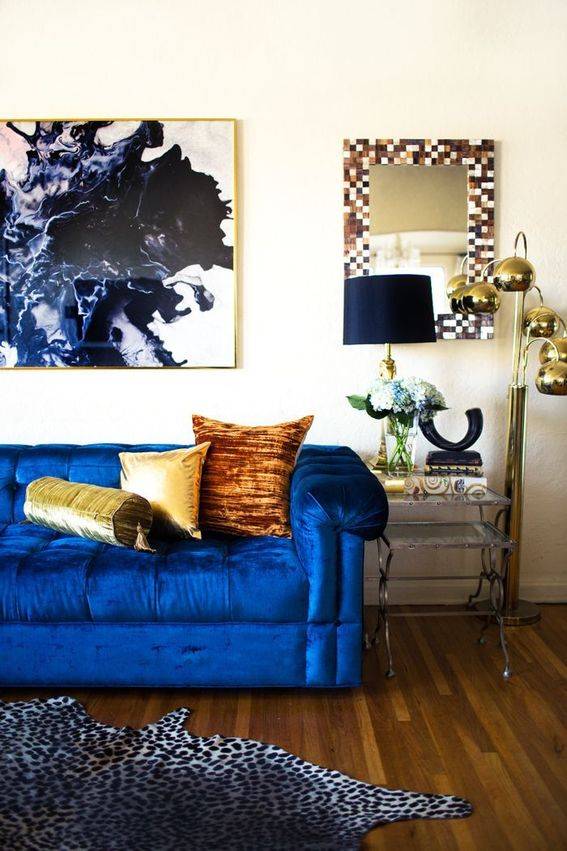
accessories? Full of life, it’s definitely a happy color.
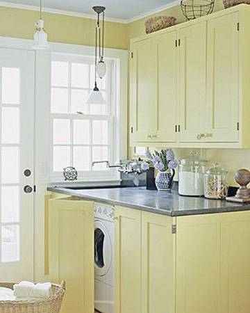
As for PPG, they picked pale yellow for 2014. The example they use from their color deck is Turning Oakleaf:
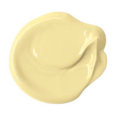
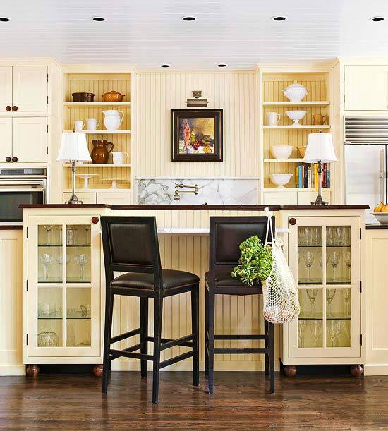
Calming after a busy day, this color can go just about anywhere. From kitchen to bedroom . . .
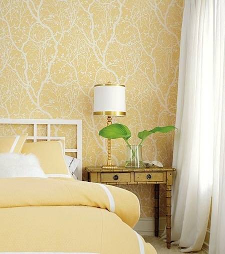
to laundry room.
So, what do you think? Are you drawn to one color more than the other??