Today I’m very proud to announce the launch of our redesigned site. I think the design speaks for itself, so I won’t go into much detail explaining all that has changed, but I wanted to describe the process we used to arrive at this new look and feel.
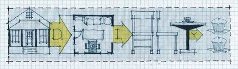
The main graphic elements in the header were designed by a very talented architectural artist named Kirsten Sparenborg (check out her AMAZING blog and Etsy shop, and buy some prints!) I approached Kirsten with the idea of designing our masthead after seeing her unbelievably cool architectural sketches of old Savanah. Like this one:

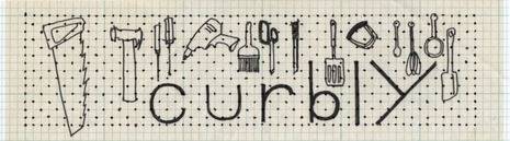
I could tell she was super-talented and understood the Curbly concept of ‘Love Where You Live’. Kirsten agreed to help out, and came up with a few different ideas:
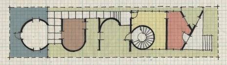
We loved these sketches, and finally (after much hand-wringing) settled on the third one, which became known as the ‘floorplan logo’. A few rounds of revisions later, and Kirsten came up with this:
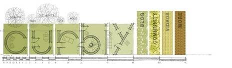
Perfect! It had an organic feel, while reflecting what Curbly is about much better than our previous design. Next, we handed Kirsten’s ideas off to the excellent Web designers at A Good Company, where Caroline Hadilaksono converted them into a more Web-friendly format. Here are some examples we had to choose from:
As you can see, the second design is pretty close to what we’re launching today!
This process was pretty unusual; merging the work of two different artists, one print-focused, the other web-oriented and coming up with something that really feels right. I want to thank Kirsten and Caroline, as well as our Curbly writers DIY-Maven, Chrisjob and ModHomeEcTeacher (who provided invaluable feedback and testing) for helping make this redesign a reality.
So, what do you think? Leave your comments (and questions) below. I look forward to hearing your thoughts!
Bruno Bornsztein
Publisher, Curbly.com