
Pantone did something radical for 2016. They picked TWO colors of the year: Rose Quartz (13-1520) and Serenity (15-3919). But that’s not all. They didn’t single them out as individual colors (as in either or) but both (as in blending). The colors, they say, create a balance of warm and cool tones and blur gender lines. They suggest that the emotions they invokebring peace and order. That’s all well and good, but they are a far cry from recent Pantone Colors of the Year. Remember Marsala from last year? Or how about Radiant Orchid? Or Emerald? Or Tangerine Tango?
Pastels they were not. And even though this year’s colors are pastel, that doesn’t mean fans of them aren’t restricted to using them with only other pastels. Here are some combinations Pantone suggests using:
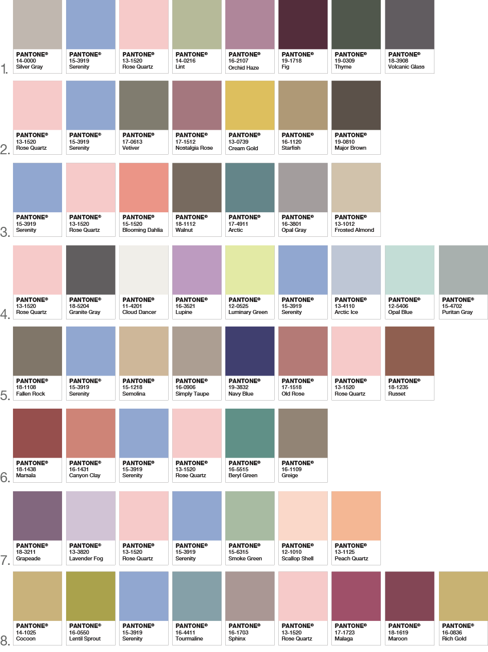
That’s a lot of color from which to choose, but as you can see, both Rose Quartz and Serenity are featured in each of the palette suggestions. Taken at a glance, how do you feel about these choices/combos? How do you feel about the original pair that inspired them?
For more information about Pantone’s 2016 colors of the year, click here.
not much. they pretty well suck
Boring. But a million times better than last years’ dried blood stain, so ::shrugs::
I’m not a huge fan of the colors themselves, but I can certainly appreciate the aesthetic choice that Pantone has made with this year’s choice(s). As stated by Curbly above, I see it as a nod to gender equality as well as gender neutrality. With gay marriage passing in the supreme court and transgender and women’s equality in the public forum, I see this as a very bold and progressive step on Pantone’s part.
While I appreciate the thought behind the choice, I still think they’re right out of the 80’s.
Which is not good