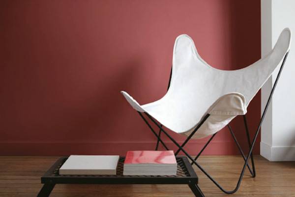
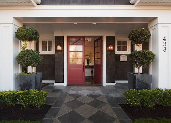
Pantone We knew this was coming…. Pantone announced its color of the year just days after Sherwin-Williams unveiled their pick. We explored S-W’s choice, Coral Reef, earlier this week that included images that proved it lived up to its descriptors “versatile, carefree, and cheerful.” Now enter into the ring Pantone’s pick: Marsala. It’s described by Pantone as earthy, nurturing, fulfilling, and hearty, just to name a few adjectives. Does it live up to them? This time, I’ll let you decide. Here are a couple of images of the color in action:

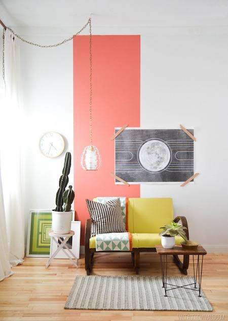
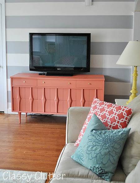
And to refresh your memory regarding S-W’s pick, here’s the Coral Reef:
So, what do you think? Who wins the heavy weight, Color of the Year match this go-around? Pantone or Sherwin Williams??
Coral Reef!!! Coral has always been my very favorite color for clothing and home decor.
Coral Reef all the way. Not a fan of earthy reds.
Marsala! Love deep reds.
Though Marsala is rich, deep and earthy, Coral is the fresh, bright and more versital color we need in a dark year!
Marsala!! I prefer the darker more earthy colors. I think Marsala will be a color you can leave on the wall longer than the more trendy Coral Reef. Marsala won’t look dated as quickly as Coral Reef.
I like them both & think they’d look great together.
For decor, I don’t care for either one of them. They both seem like serious throwbacks to decor trends I didn’t like the first time. Marsala looks like the burgundy-ish mauve of the late 80s/early 90s (think florals with hunter green backgrounds.) Coral reef reminds me of the 80s pastel “southwest” decor or something out of a Florida vacation condo.
Of the two colors, I like Marsala better. The only orange colors I like are deep, rich ones–terracotta & burnt orange.
Marsala looks like an excellent color for lipstick, nail polish, and clothing for either men or women. I just can’t visualize it in my house without having 80s/90s flashbacks.
They both are terrible. Marsala is exactly the mud color of dried blood, and I agree that Coral Reef looks like somthing out of Florida or the southwest.
Blecccchhhhh!
Marsala is warm and calm. I love deep reds.
I do think they both look like retro colors. If I had to pick, I’d go with Coral Reef. Now next year are we going to have Harvest Gold and Avocado Green??