
In my first post about choosing colors for the Curbly House, I found all kinds of beautiful color inspiration using the Sherwin-Williams’ Chip It! tool. This little button led me to some great color combos and palettes, and helped me select wall and trim colors for nearly every room in the house! But the ChipIt! tool also helped us think about how to bring accent colors into each room through paint and decor. Read on to find out what I’m thinking, and to give me your feedback!
We’re eager to revive a few old pieces of furniture with brighter paint colors. These are colors that I thought would be too bold for the walls, but still could add a great pop of personality to a room. I’m also thinking up ways to add color blocking accents to a few walls and rooms.
Here are some color choices I made and a few examples of how they can bring in additional color to a room. You can see all my Chip It! inspiration cards on my Pinterest board (and don’t forget to follow me while you’re there!)
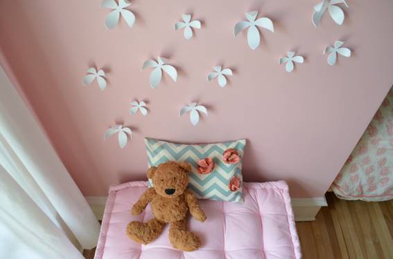
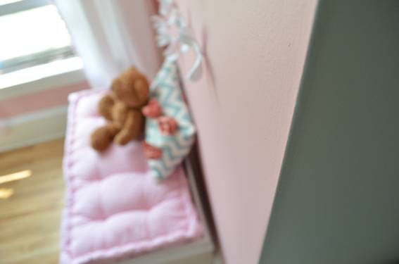
NOTE: All the photos in this post are cropped pretty close, because we’re saving the big room reveals for later in our Curbly House series.
Ayla’s Room Chip It! Inspiration
How We Used It:
We chose Rainwashed (SW6211) for Ayla’s wall color, and then brought in the color Lotus Flower (SW6310) to incorporate the pink from our fabric swatch. We applied the Lotus Flower color to the back panels of her bookshelf and night stand, and also plan to paint the walls surrounding her window nook in this same pink. We’ll break up this bit of pink around her window with white curtains and these flower wall magnets.
As a reminder, here’s our Chip It! card (we strayed a bit from the exact color recommendations, but found the suggestions really helpful as starting points):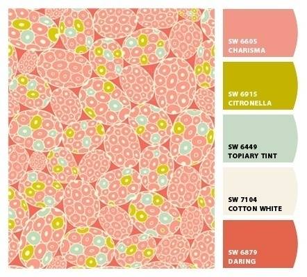
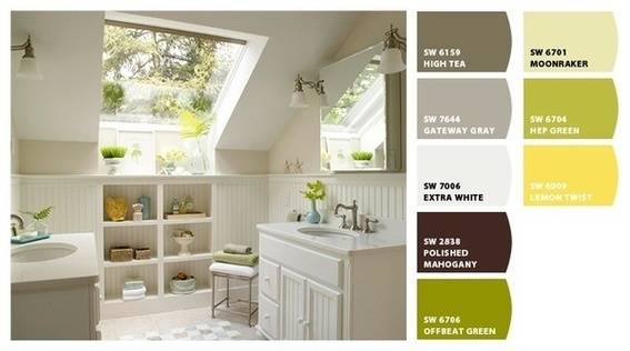
Upstairs Bathroom Chip It! Inspiration
How We Used It:
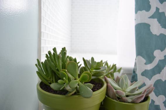
We fell in love with Quietude (SW6212) for the wall color because it worked so nicely with the gorgeous white glass tiles we chose for the shower and floor (they’re the Lush 1×2 Cloud from ModWalls.com). This color also looked great with the wood tone in our vanity. We wanted to bring a little extra color into the room to give it a more organic feel, but were careful not too do anything too dramatic because this room is tiny. The Chip It! tool reminded us that greens would be a nice accent color and give the room a more organic feel, so we purchased some succulents and added a little extra color by painting terra cotta planters Offbeat Green (SW6706).
Here’s the original Chip It! card:
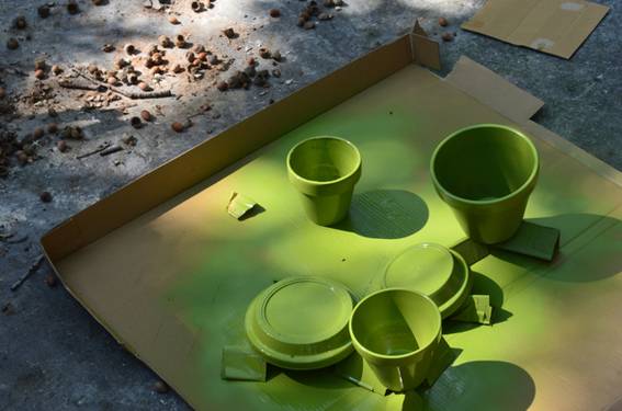
(By the way, I spray-painted these by putting my normal Sherwin Williams latex paint in a hand-held, aerosol-powered sprayer like this one)
(Those tiles you can barely see in the background are from ModWalls.com, we’ll be talking more about how much we love them later).
So, these two simple projects (painting the shelving in Ayla’s room and coating a few terra cotta planters) added wonderful pops of bold color. We’re thrilled with the results!
How about you? What’s your favorite way to add color without overwhelming the walls? If you’ve tried the Chip It! tool, did you find any exciting combinations that really made your room? Let me know in the comments.
This is a post in the Curbly House series! Follow along as we document every step of our complete home makeover, from gutting the walls to putting up the finishing touches. And don’t forget to let us know what you think in the comments!
ModWalls.com is one of our bathroom sponsors for the Curbly House project. They’re the best!